Playtika is a leading gaming company with over 30 million monthly active users playing its titles. Since 2010 Playtika has been a pioneer in the gaming industry and were among the first to offer free-to-play social games on social networks and, shortly after, on mobile platforms. After a period of significant growth, Playtika’s story as a brand had to evolve and reflect recent changes - and that’s where we came in. As part of this massive rebranding project, we helped the company redefine the brand identity, implement that story into the employer brand, shape new messages and design the new company website. Wanna see how? Let's play!
The cheetah is a very familiar and beloved icon within the Playtika culture so it was pretty obvious that the cheetah was here to stay, our task was to tell it’s story from a new perspective. Throughout the rebranding process, we’ve gone back and forth with different ideas for the new version of Playtika’s cheetah, while understanding along the way that the cheetah needs to convey movement as opposed to the previous version that showcases a very static cheetah.
Through endless sketches we’ve learned that the shape casing the cheetah needed to feel in motion somehow, and after testing various ideas we’ve learned that the cheetah’s spots felt very natural in their motion and decided to use their motion to portray the story of our dynamic new cheetah...introducing “the ellipse!”.


The next phase was to incorporate this feeling of motion and “not-standing-stillness” throughout the whole brand experience. We set out to bring to life a new system based on the new brand belief of “LIFE NEEDS PLAY” both in terms of design, but also in terms of messaging. Every message conveyed the belief and supported Playtika's story as a company offering infinite ways to play.
For the typogprahy we injected a sense of fun and "waviness" with animated elements coursing through the letters, giving a sense of constant movement.


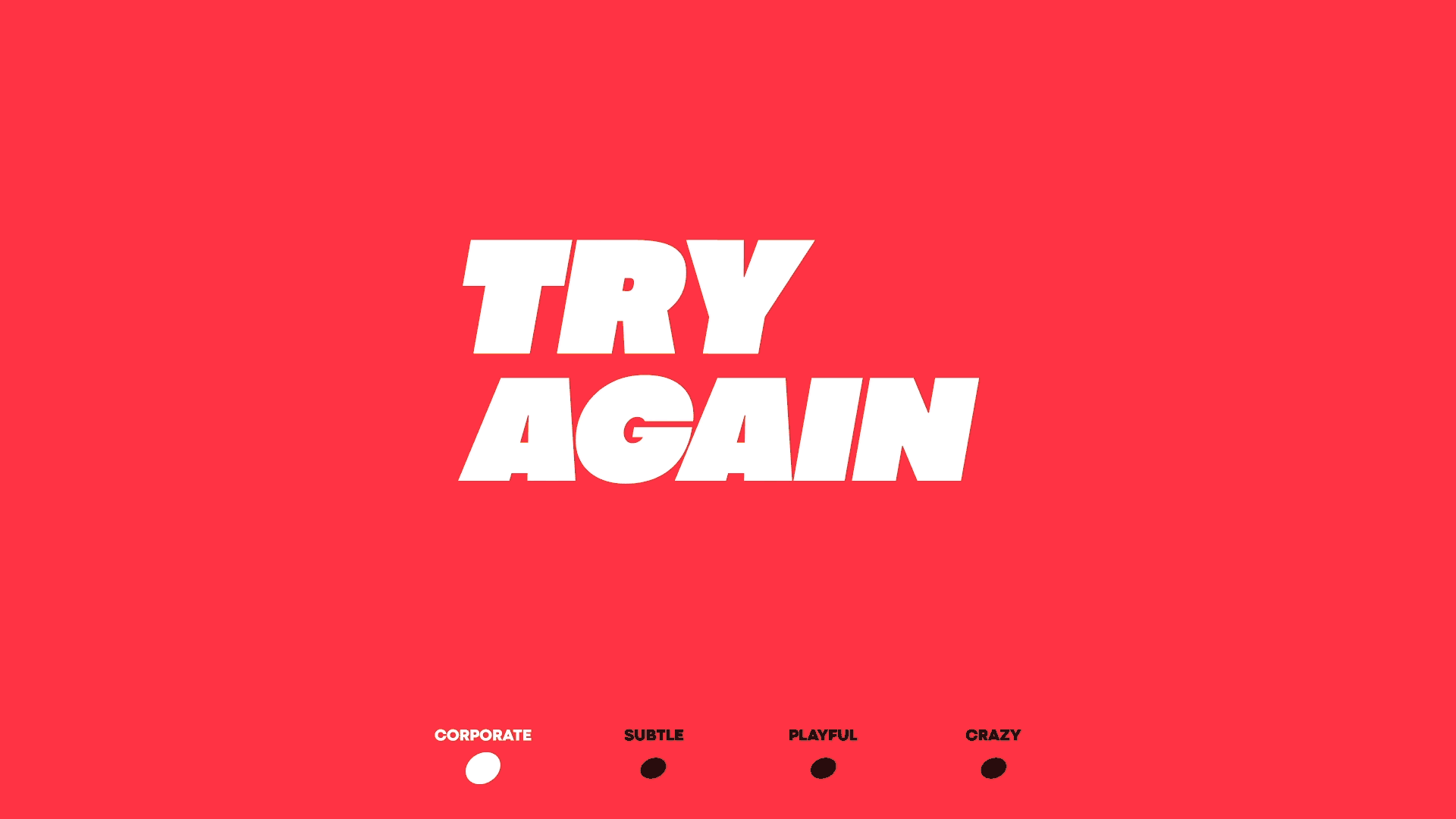
The challenge was to create a method where the design system allowed corporate issues and playful internal issues to work seamlessly together while maintaining the correct volume of “fun-ness”... We called this volume system “The fun meter”.
Since Playtika is an international company we needed to make sure that the design system was clear and simple to use, so basically “The fun meter” allowed us to understand how fun we needed to be per element designed.
We expanded the colour palette beyond the red & black that was previously associated with the brand in order to give the company more tools to work with.


We interpreted characters and elements from Playtika's games to create a set of icons for the company. Each of the characters were given a fresh and unifying look so that it was clear these are Playtika's icons and not just random characters taken from the games.


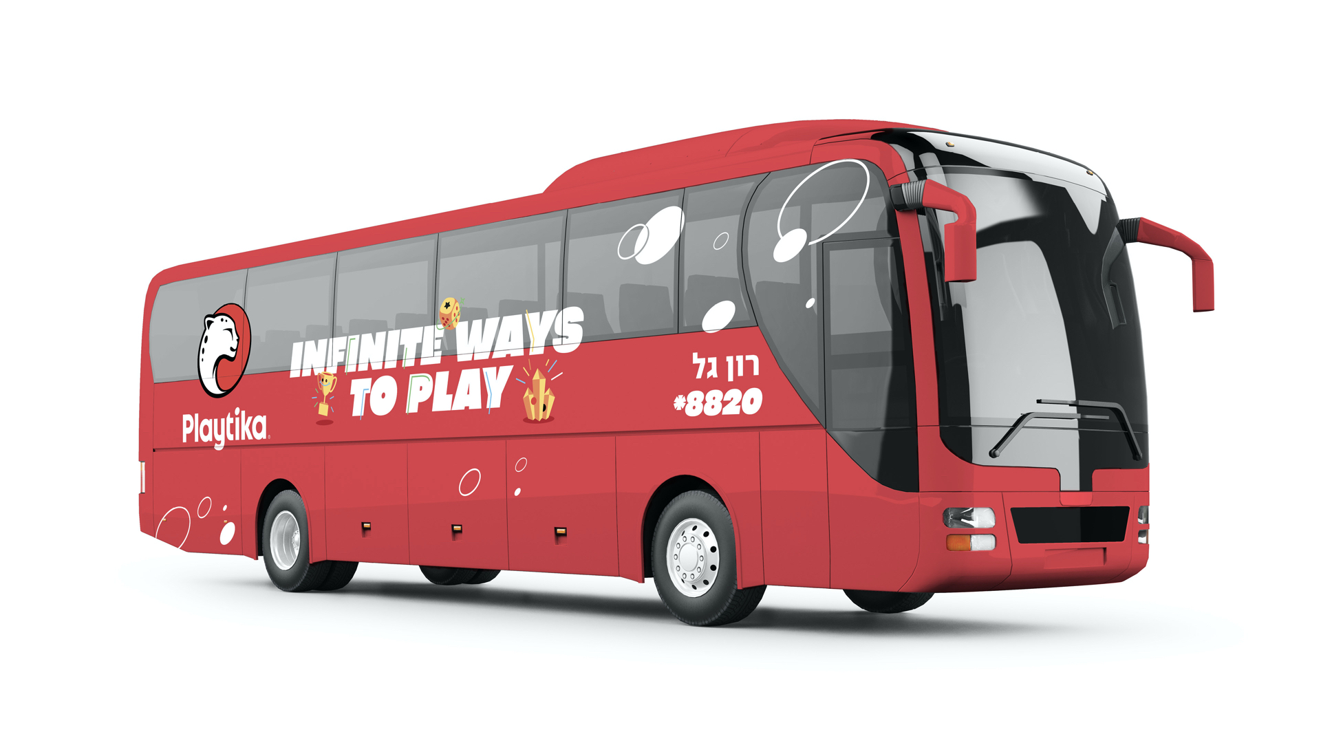
No stone was left unturned, and no corner of the company was left without a redo. Everything - from the bus ride to work to the notebook new recruits receive - got a facelift to reflect the new company narrative.
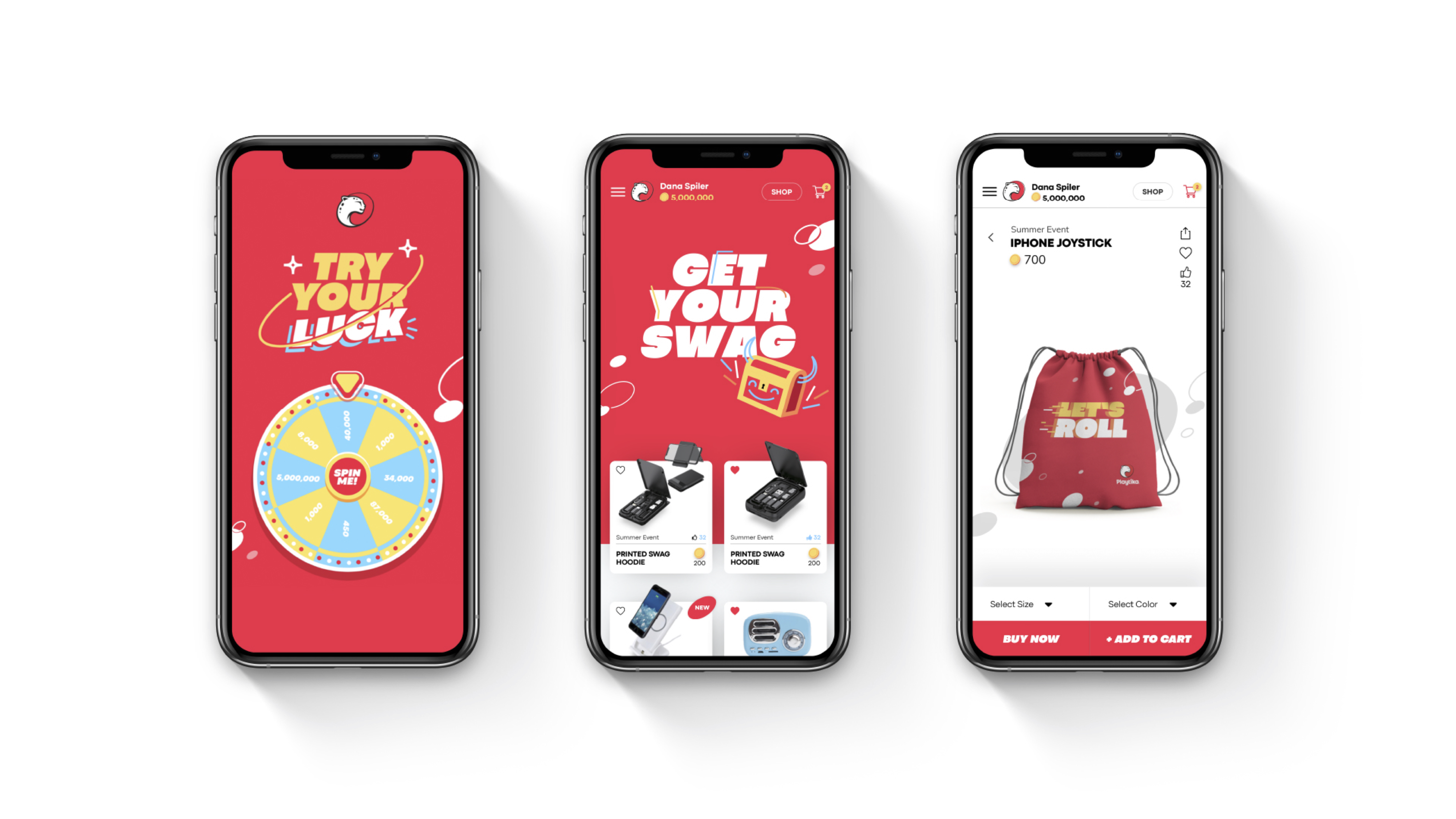
The design also carried through to their new website, which we filled with animated details to give it that playful feel only an entertainment company can provide. We even created a swag store where employees can order custom-made merchandise.