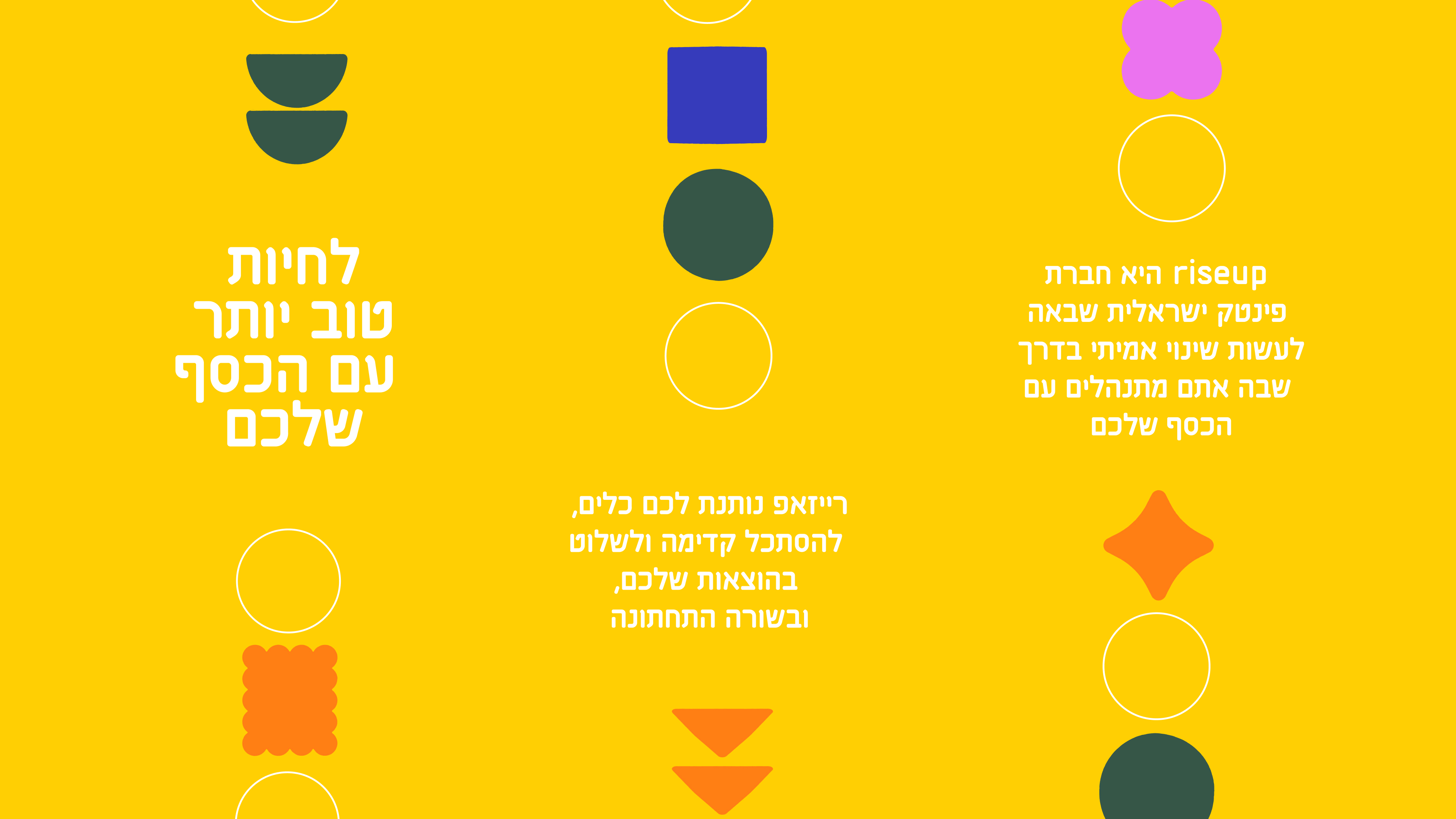
How can design transform an early-stage startup into a trusted national innovation leader? And how can you jazz up an everyday tool so it's not just another corporate bore, but something that gets everyone excited? Well, our design wizards rolled up their sleeves and gave RiseUp, a tool that helps their customers make the most of their money, a brand-new look. Our aim was to match its visual style to the awesome product it already is, grab the attention of its users, and make it a go-to name in the fintech world.
RiseUp embarked on a mission to propel its brand into the stratosphere as a professional and nationally recognized innovation leader. The brand strategy centered around a fundamental question: “What can you do with your money?” While competitors all offered the empty promise to make you richer, RiseUp took a refreshing approach – take back the power of making smarter financial decisions into your own hands.
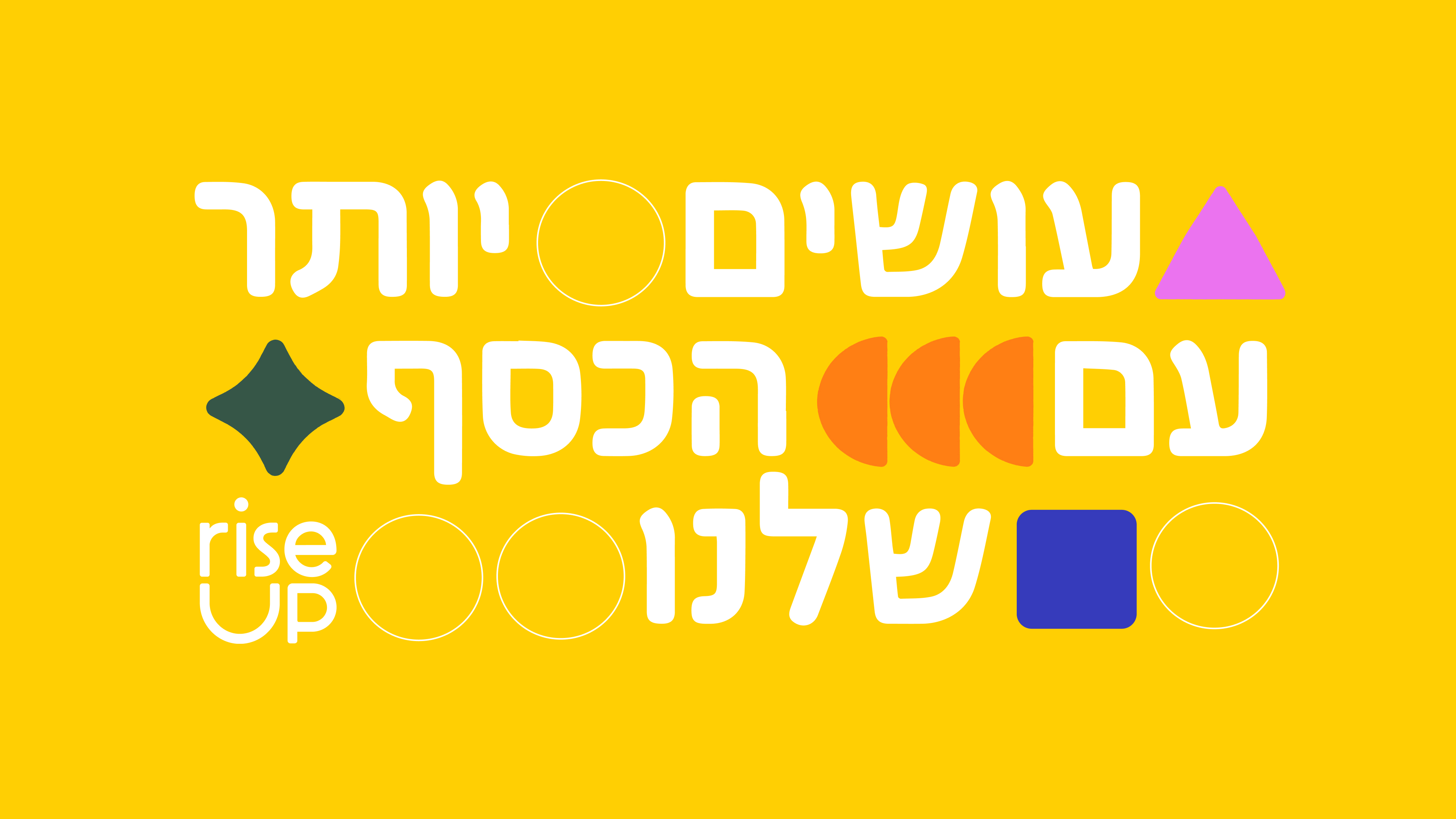
When it comes to logos, it’s all about getting your brand essence across as effortlessly as possible. For RiseUp it was important to reinforce the brand’s purpose of securing your finances. How’d we do it? We reconstructed the logo to symbolize a safe holder for your money, with the ‘U’ in ‘up’ playfully manipulated to illustrate a pant pocket or piggy bank. As an additional twist, we animated the dot above the ‘i’ to land slightly higher than usual, giving it an elevated, risen effect that reinforces RiseUp’s core message – do more with your money.

RiseUp is all about empowering people to take the reins of their financial lives and unlock their full potential. As a tool designed for the everyday man and women to understand how to get the most out of their money, we knew the brand identity had to move away from a corporate feel and instead become something that resonates with everyone.
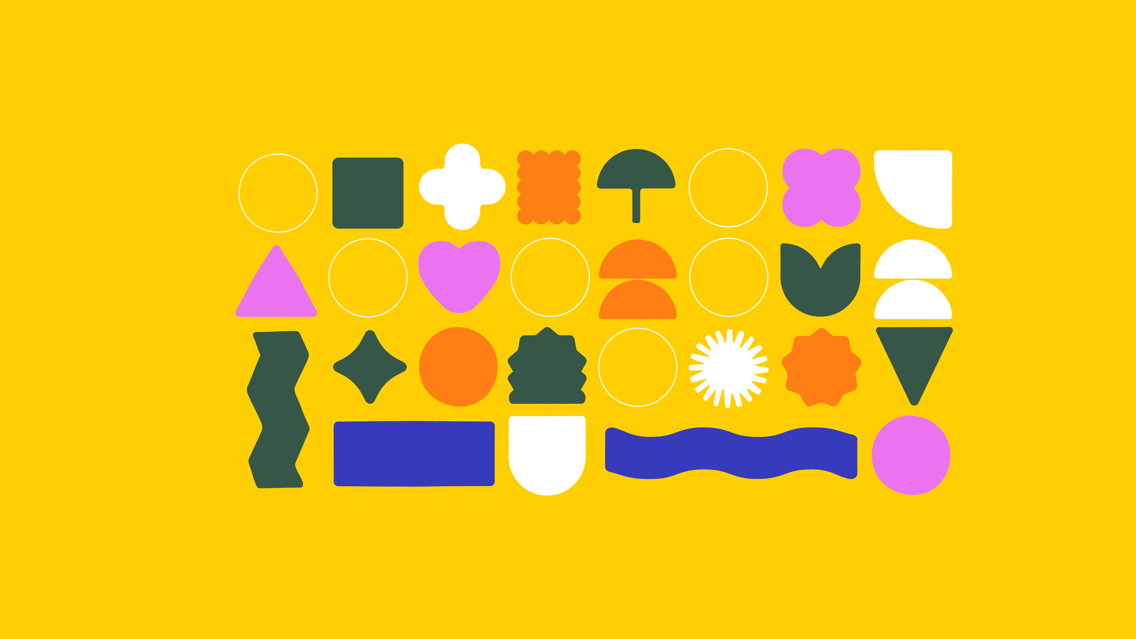
The new visual identity is an eclectic assembly of shapes infused with images, chosen to represent the many facets of a user's financial ecosystem. This creative visualization symbolizes how all of a user's assets can be organized and optimized. With this clear, bird's-eye view of their financial landscape, users can better understand all they can do with their money.


Revolving around a human-centric approach, the photographic language places the faces of our audience as the hero of our images, so that anyone can see themselves in the brand. Each photograph captures real individuals in authentic moments. By centering the focus on people, RiseUp's visual storytelling evokes a sense of relatability, empathy, and a genuine connection, reinforcing the brand's commitment to empowering and uplifting its users along their financial journeys.

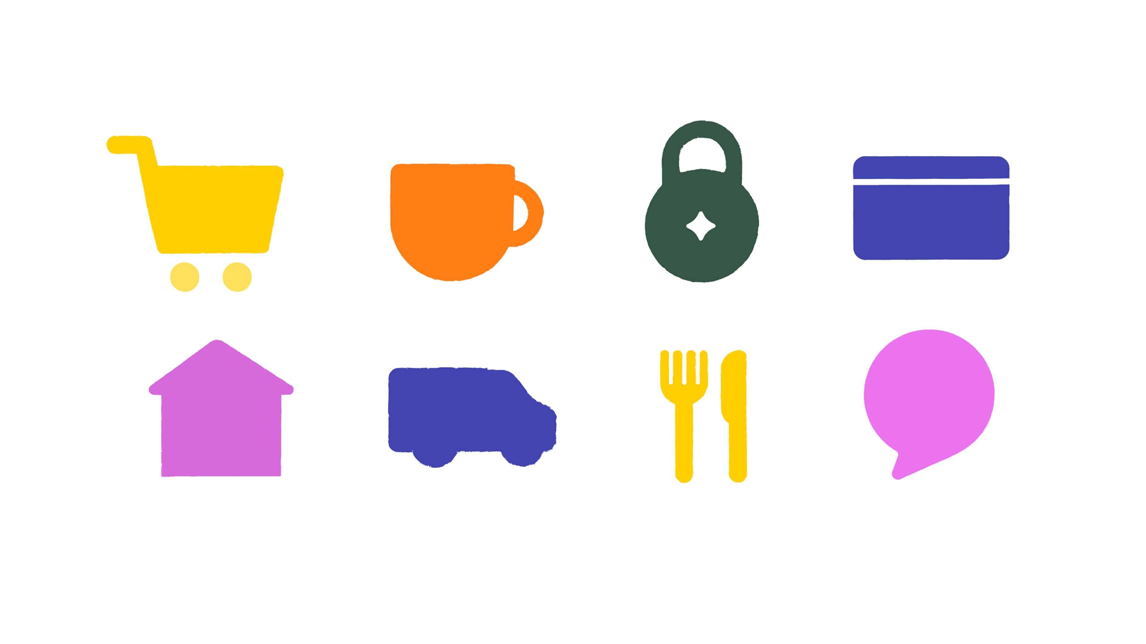
The brand is all about creating warmth and humanity in every detail. You feel it in the friendly icons we’ve crafted and in the color palette we used, all carefully chosen to exude a positivity, familiarity, and approachability that anyone can connect with.
When it came to translating RiseUp's revamped identity into a website, the key was to ensure every aspect of the design resonated with the average person. Through the warm graphic language, color palette, and client-centered imagery, from the first moment they enter the site, the user experience is a personal one -- inviting them in and taking the fear out of their financial journeys.


